CURTIS

RESTAURANT SUPPLY
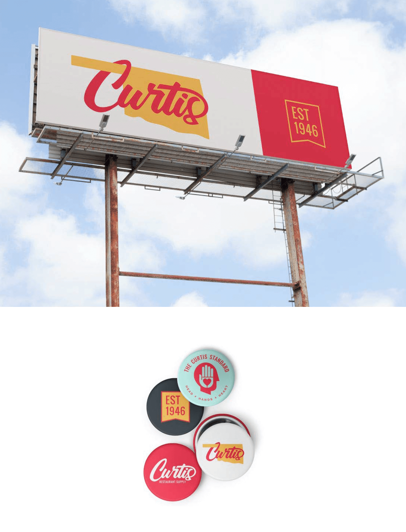
Rebranding Curtis Restaurant Supply was about visually connecting their heritage and long standing customer base with a new look and feel.


Curtis Restaurant Supply had both heritage and a service standard that we felt like set them apart from their competitors. We gladly expanded our branding efforts to incorporate the values visually and in voice in ways they had not yet explored.

EXPANDED MEANING
While the red and grey was the signature of Curtis, they were extremely limiting and displayed an insufficient contrast. We expanded their color palette with meaning and intention.
2 aspects of the brand

REINTERPRETING HERITAGE
For those in the region, restaurant supply was defined by Curtis. They have a reputation of service that goes beyond the sale. We were tasked with staying close enough to be easily recognizable — but updated enough to face the future.